 Back to all articles
Blogs
Top 4 Elements of a High Converting Product Page


Don’t let the pessimists steer you off the road. Product page conversions can be hard to achieve but if you pull in the right strategy then things can change in a flash for you!
The world of online marketing is so vast and competitive that it’s normal to fall under the trap of negativity. Do you have a product page that isn’t seeing a lot of sales? Is the competition a little too tough for you?
If yes, then you have to read this blog!
Product Page Conversions:
We often see that eCommerce sites fail to take off and the explanation given is simply that there’s too much competition when it comes to product page conversions. Let us ask you one thing, if there’s demand out there then don’t you think you can meet that demand? Millions of transactions occur in minutes over eCommerce platforms all over the world and you really think that you can’t be the one making a sale? Well, it’s time you put your pessimism on the side and focus on the following four elements of a high converting product page.
1- The Element of Effective Pricing:
The first element of a high converting eCommerce product page is the pricing. We’re not going to talk on how to price your product, that’s totally on you. If you think your product is worthy of a certain price tag, then don’t undersell it. However, we can talk about the way you can manipulate pricing information. For example, if you see your product isn’t getting a lot of sales then try adding a premium product along with the original one. Except, the price for the premium product should be at least twice as much as the original one.

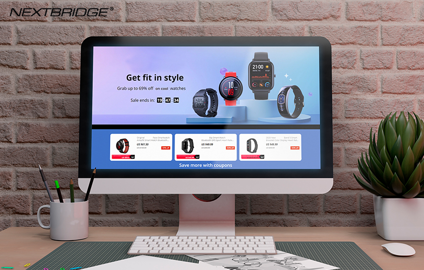
You’ll see a total jump in sales on the original product as visitors do see these things. Once they realize the premium is at such a high price yet the features are more or less the same as the original one, they’ll definitely buy your original product. The above example shows the discount that is being offered which can make the product quite tempting.
2- Set the Timer:
Ever worked on something while there’s a timer on? We have, and we know that it puts in urgency because you just have to get the job done within that specific time. Apply the same approach when you’re selling products on your product page. If you add a timer that a certain product will run out of stock within 24 hours, then you’ll create urgency among your potential customers. This is one of the most effective ways to get your sales going. Even if you have plenty of stock available, setting up a timer won’t harm as it will create a sense of urgency.

Timers can be used in different ways to get high product page conversions and another popular way is to put timers on special discounts. If you really want to sell your products on a discount, then set the timer as its effectiveness is unparalleled.
3- Buttons, Buttons & Buttons:
People love buttons but what they hate is a button they can’t see or if they see it too much. Do you get our point? Your main priority as a designer should be that your customers know what your product page is all about. Once they enter your product page, it shouldn’t make their head explode with clutter. Similarly, the buttons on your site shouldn’t be so unnoticeable that people actually miss out on them. The Buy or Add in Cart button is of the essence here and must be sleek with a design that stands out from the rest of your website.

Don’t forget, you don’t need to overdo it. It’ll just make your visitors annoyed.
4- Make them Remember:
If you’ve got a visitor who has surfed your website, looked at some products but ends up leaving your website then don’t fret. You still have a chance to get that sale and improve on your product page conversion rate.
For this, you do need a bit of luck but once you get that luck you’re getting that sale. The luck is centered around whether the potential customer will come back to your website or not. If he does, then what you need is a panel on your product page the depicts all the previous products a customer looked at. If he’s really back, he’s probably looking for a product that he wants to buy so better to pull out his history in front of him.

In a Nutshell:
A healthy product page conversion rate is essential when it comes to competing out there. And when you’re on the battlefield, you need to have all your elements aligned in perfection. Of course, all the basic elements of a product page must be covered prior to the implementation of the above four. But once you do implement these, you’ll see the difference will be staggering. If you have an eCommerce store or you want to get one, then Nextbridge developers can help you out! Hit us up today and make your dreams a reality!
Don't hire us right away
talk to our experts first,
Share your challenges, & then decide if we're the right fit for you! Talk to Us
Partnerships & Recognition
Commitment to excellence


